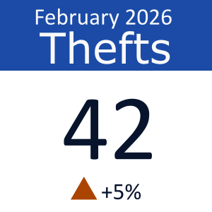
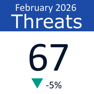
A chart or map may not always be the most appropriate data visualisation type. When conveying a single key indicator or main message, a Big Aggregated Number (BAN) can often be more effective. A BAN can draw attention and quickly convey the main point of a report; aid in navigation of a report by highlighting important findings; and encourage further exploration of the report in more details.
Best practices
- Define clear objective: what is the purpose of adding this BAN?
- Choose the correct metrics: BANs show only a single value. It is important to consider if the chosen value is relevant, meaningful and in line with the report’s objectives
- Prompt further analysis: BANs offer opportunities for further analysis. Link a BAN to the surrounding text by further breaking down the number.
Use BANs when:
- You want to emphasise a primary takeaway.
- The number is meaningful without extra context.
- Highlighting progress or trends
- Decision support
Avoid BANs when:
- The insight relies on comparison or context.
- You need to show trends or distributions.
Rules (3 seconds)
Mandatory
- One metric
- Short label
- Strong insight-driven title
- Clear units
- Use brand colours
Allowed
- Micro-trend indicator (↑ / ↓)
- Data colours: Pine (green) and Rust (red) for trend trend indicators
- Short subtitle
Disallowed
- Multiple metrics
- Legends
- Comparisons within the visual
- Other data colours
Examples
Cards / KPIs
Shapes